Boost Local Foot Traffic: Custom Storefront Signs for Richmond Small Businesses in Richmond, VA

Want more people to step inside your shop today? High-contrast, well-lit storefront signs make it easier for shoppers to spot you fast. In walkable districts like Carytown, The Fan, and Shockoe Slip, a strong sign can be the difference between a passerby strolling past or walking in. If you are exploring business signs that fit Richmond, VA streetscapes and weather, this guide gives you clear, local steps.
Why Contrast Drives Walk-In Traffic On Richmond’s Walking Streets
Foot traffic moves quickly. People in Carytown scan storefronts while chatting, sipping coffee, and checking their phones. Your sign has a split second to land. That is why **high contrast is king**. Dark letters on a light background or light letters on a dark panel let the brain decode your name faster. Quick recognition lowers hesitation and pulls attention toward your door.
Color pairings that typically pop in bright sun and under shade trees include:
- White on navy or black
- Yellow on charcoal
- Black on white or pale gray
- Rich red or orange on matte white
Add negative space around your letters. Crowded designs tire the eyes. Clean space creates a “target” for the gaze and makes quick reading easier at 20 to 40 feet on busy sidewalks.
Design Choices That Work In Richmond, VA Weather
Richmond sees hot, humid summers, bright sun, thunderstorms, and winter cold snaps. Your sign materials must handle UV, moisture, and temperature swings. **Use weather‑resistant materials** that hold color and shape all year.
Good picks for storefronts on brick, stucco, or wood facades:
- Aluminum or aluminum composite panels. They are lightweight, rust resistant, and stable in heat and cold. Powder coating helps color last.
- Acrylic or polycarbonate faces for lighted cabinets. Polycarbonate is extra impact resistant, useful near sidewalks and parking lots.
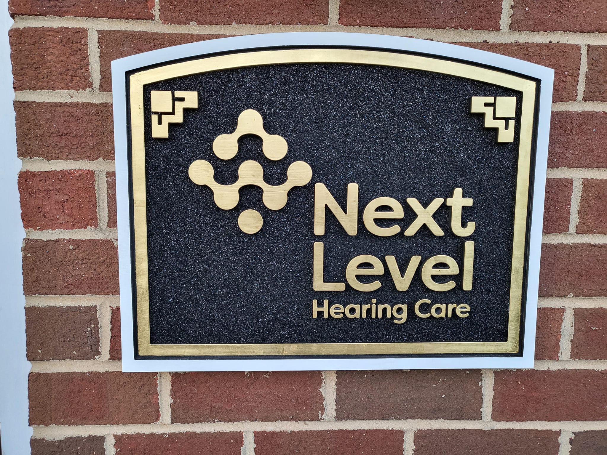
- Dimensional letters in cast aluminum, formed plastic, or HDU (high-density urethane). These keep crisp edges and take paint well.
- UV-stable inks and films for graphics. Ask for laminated prints that block fading during long Virginia summers.
Hardware matters too. Choose stainless or coated fasteners to avoid streaking on brick after heavy summer storms. Seal edges where water could pool. If your storefront gets afternoon sun on West Cary Street, consider matte finishes to cut glare.
Lighted Signs For 24/7 Visibility
Even if you close at 7, the store that glows gets remembered at 9. LED illumination uses little energy and keeps your name clear through dusk, rain, and winter evenings. Aim for warm-to-neutral light that fits historic blocks and tree-lined streets.
Popular options that blend style and function:
Lighted letters or halo glow. Dimensional letters with internal LEDs or a soft back glow add depth without overpowering nearby storefronts. A gentle halo improves legibility against textured brick in The Fan.
Sign cabinets with routed faces. An aluminum face with push-through acrylic letters gives sharp edges and even lighting. It holds up well when temperature shifts fast.
Gooseneck lighting for classic looks. If your brand skews vintage, targeted fixtures reduce spill light and keep attention on your name. Use LED bulbs for efficiency and consistent color.
Readable From The Sidewalk: Size, Fonts, And Layout
Letter height affects quick reading. As a simple rule of thumb, plan about one inch of letter height for every 10 feet of viewing distance. On a typical Richmond sidewalk, that means 3 to 5 inch main letters for people 30 to 50 feet away. Simple sans or clean serif fonts beat scripts in motion. Avoid thin strokes that disappear under glare or rain.
Prioritize your most important words. Your brand name should be the hero. Taglines and hours can live on a window graphic. **Keep letter height readable** and protect your white space so each line breathes.
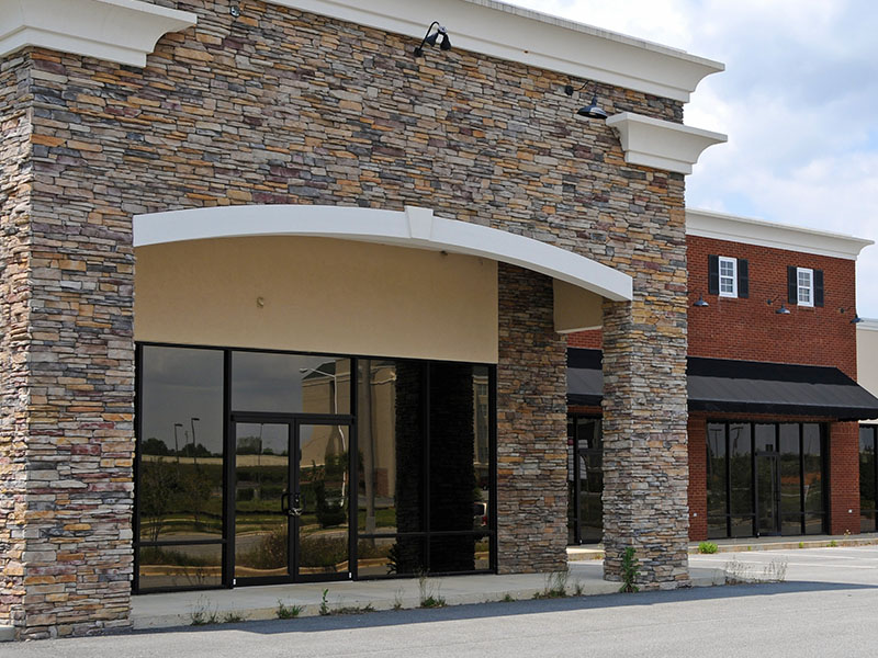
Materials Match: What To Use On Brick, Glass, Or Wood
Richmond buildings vary. Choose the material that bonds well and lasts on your surface.
Brick or painted masonry. Cast aluminum or formed plastic letters with stud mounts look upscale and avoid staining when paired with proper spacers. For panels, use aluminum with a standoff frame so moisture vents behind it.
Glass storefronts. Vinyl window graphics and contour-cut logos layer nicely with an exterior lighted blade sign. Acrylic letters can mount to interior panels that float a few inches from the glass for depth without exterior drilling.
Wood trim. HDU letters with high-quality paint and clearcoat mimic carved wood without the splitting that real wood can see after freeze-thaw cycles.
Local Psychology: How Shoppers Scan Carytown And The Fan
Walkers look first at color blocks, then at shapes, then at words. Use a high-contrast color block as a base, a simple shape like a circle or shield, and a short brand name above the door. Sidewalk traffic also reads at an angle. A projecting blade sign perpendicular to your facade can catch eyes faster than a flat panel alone. Pair both for the best chance to stop the scroll of street life.
Richmond-Proof Finishing Touches
Humidity tests finishes. Ask for sealed edges on panels and a UV-protective clearcoat on painted letters. **Light it for 24/7 visibility** so your name stays visible on foggy mornings and early winter evenings. If your doorway sits under heavy tree cover, choose whiter LEDs so lettering cuts through green shade. Near open plazas, slightly warmer light can feel more inviting.
Quick Curb Appeal Checklist To Audit Against Your Neighbors
Use this simple pass-or-fix list. Stand across the street. Compare your storefront to the two shops on either side and the one directly across.
- Can you read the main name in under two seconds at 30 to 40 feet?
- Is there strong light-dark contrast between letters and background?
- Does the sign avoid glare at midday and stay bright at dusk?
- Is the letter height large enough for a walker to read on the move?
- Is there clean negative space around the name and logo?
- Does a projecting blade sign catch eyes at an angle on the sidewalk?
- Are finishes free of rust streaks, peeling film, or faded paint?
- Are fasteners and edges sealed to handle summer storms?
- Does lighting color feel inviting and match your brand?
- Is wayfinding clear from the curb to the door handle?
- Do window graphics support the main sign without clutter?
- Is your sign more legible than the three closest competitors?
Tie Your Sign To Your Brand Story
Shoppers remember signs that match the vibe inside. If your shop sells handmade goods on Cary Street, a textured panel with raised letters can hint at craft. A tech startup off Broad Street might lean toward crisp aluminum letters with a cool white halo. Keep colors, fonts, and tone consistent on your main sign, window graphics, and interior wayfinding. If you are deciding between layouts, prototype with a large printout at full scale. Tape it up. Step back across the street and check readability.
When To Choose Dimensional Letters Versus A Panel
Dimensional letters deliver a premium look and make brick count as your background. They work well when the wall itself has character. A panel or cabinet works better when you need a high-contrast field behind your name or want internal lighting. Blade signs help with side-angle viewing on narrow blocks. Many Richmond storefronts use a combo: a main fascia sign plus a blade for walkers and a window logo for close-up branding.
Plan With The Right Partners
Look for a local team that can survey your facade, confirm mounting points, and recommend materials that suit Virginia’s seasons. If you want to see options, browse more signs categories to understand what fits your storefront and brand voice. For deeper reading on layout and finishes, check the latest topics in our articles section to spark design ideas before you commit.
Map Your Next Step In Richmond, VA
Start by locking in a high-contrast color pairing and a simple, legible font. From there, select a weather-ready construction that holds up during summer heat and winter chill. If you need help choosing fast, explore custom storefront and business signs that fit Richmond, VA facades and walking traffic patterns. You will get designs that respect local character while staying easy to read at a glance.
Brand Cohesion Across Signs And Graphics
Your exterior sign should set the tone for everything inside. Match colors and fonts on window decals, interior directional signs, and menu or service boards. Consistency builds trust and speeds decisions. If you are refreshing more than the main sign, see how complementary pieces in custom business signs in Richmond, VA can anchor your whole look while you add supportive graphics over time.
Ready To Boost Foot Traffic?
Clear, high-contrast signs help people notice, trust, and enter. Richmond sidewalks reward businesses that are quick to read and hard to miss. Connect with Style Line Co to plan a sign package that shines year-round. Call 804-530-8800 or view examples and next steps on our business signs page to get moving today.
Articles & News
-
Richmond Commercial Fleet Graphics: DOT Compliance and Local Parking Rules
If your team runs service trucks or vans around Richmond, you need Richmond commercial fleet graphics that pull double duty: turn heads and meet the rules. This guide shows how to design door lettering that checks DOT boxes and how to park wrapped vehicles in busy […]
-
Boost Local Foot Traffic: Custom Storefront Signs for Richmond Small Businesses
Want more people to step inside your shop today? High-contrast, well-lit storefront signs make it easier for shoppers to spot you fast. In walkable districts like Carytown, The Fan, and Shockoe Slip, a strong sign can be the difference between a passerby strolling past or walking […]