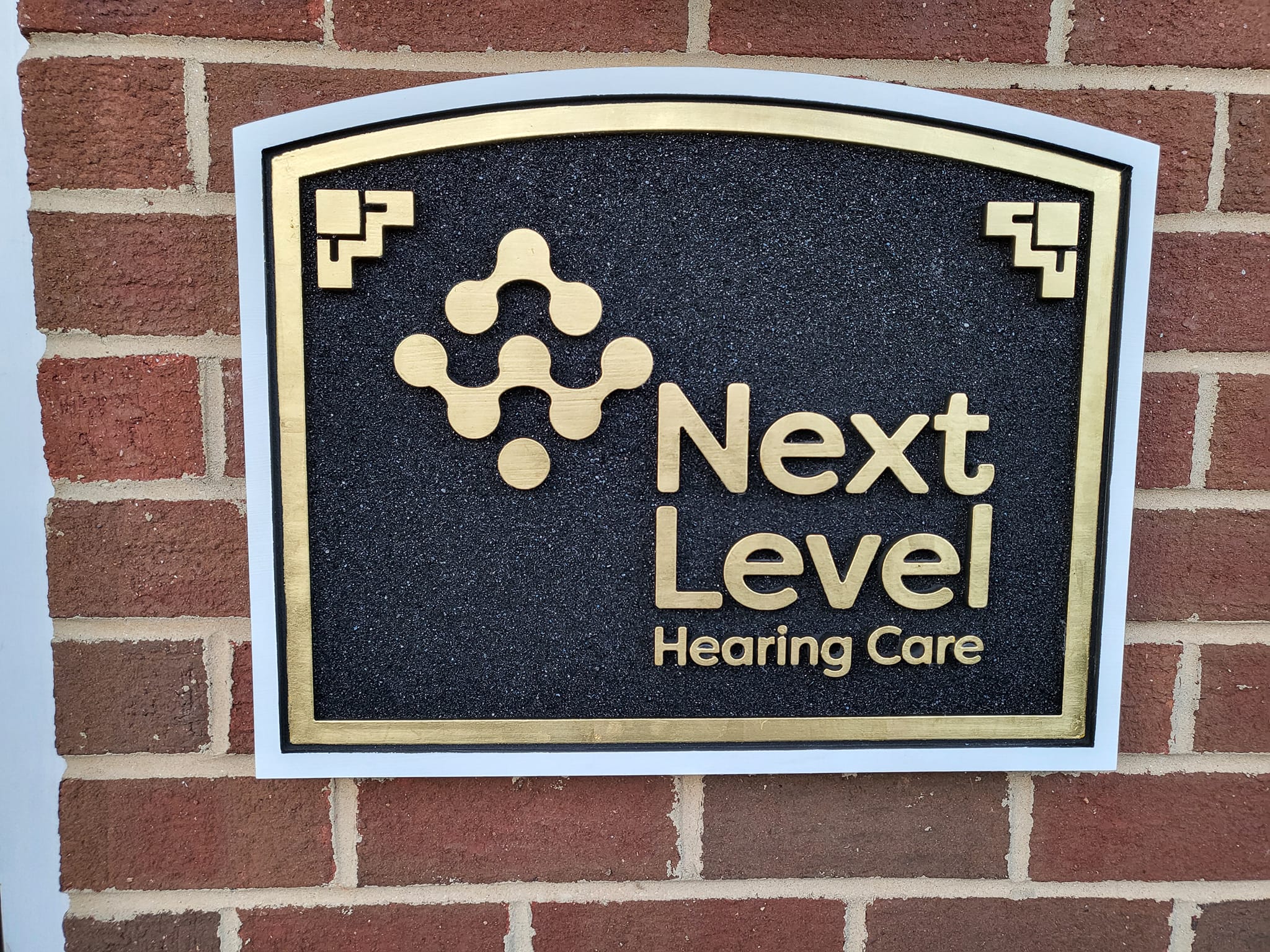
Fredericksburg Storefront Signs: Choosing the Best Materials for High-Traffic Streets
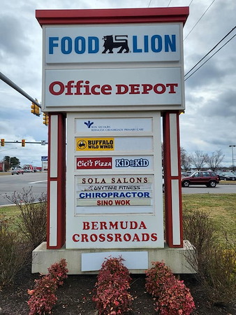
Fredericksburg storefront signs have to do two jobs at once. Downtown, they should respect the historic streetscape near the Rappahannock River. Along Route 3, they must be bold enough to catch drivers at speed. This guide walks through practical materials, finishes, and colors that meet typical local expectations while boosting everyday visibility. For a deeper look at styles and fabrication options, explore our business signs overview.
If you want a quick primer on options and design tradeoffs, start at Style Line Co. We build for humid summers, sudden thunderstorms, and winter freeze-thaw. You can also see how we think about fredericksburg storefront signs so your brand looks sharp in Old Town and along busy corridors.
What Works In Fredericksburg’s Historic Core
In the Historic District, character matters. Trim profiles, letter forms, and finishes should feel at home on brick and painted wood storefronts, even when the sign is brand new. That does not mean the sign has to be dull. The right materials and contrasts can keep your brand crisp without clashing with period architecture.
Aesthetic Fit Without Losing Readability
- Use a two-color palette plus a metallic accent to keep the look refined while improving legibility at a glance.
- Prefer serif or simple sans serif letter styles with generous stroke width for easier reading from across Caroline or William Street.
- Avoid glossy backgrounds that mirror the sky or passing cars; low-sheen paints reduce glare and keep letters clear.
Materials That Age Gracefully By The River
Moisture from the river and seasonal temperature swings call for stable sign cores and durable finishes. Carved high-density urethane (HDU) is a strong pick because it resists rot and splitting. Painted hardwood like cedar can look beautiful but needs more upkeep. Metal plaques in bronze or aluminum add a timeless note for professional offices and galleries near Princess Anne Street.
Materials That Stand Up To Virginia Weather And Traffic
Busy corridors like Route 3 demand a tougher build and bolder contrast. The goal is a face that stays flat and true through storms, sun, and vibration from nearby traffic.
Carved Dimensional Signs: HDU vs. Hardwood
HDU takes crisp carving for letters, borders, and appliqués. It is lighter than wood, which helps when mounting to older facades. A marine-grade primer and two-part topcoat seal the surface for longer color life. Hardwood, especially cedar or redwood, offers rich grain for a classic look. It performs well if properly primed, edge-sealed, and maintained on a regular schedule. Add raised letters or routed recess panels to create shadow lines that improve readability in daylight.
Metal And Composite Panels For High-Traffic Corridors
Aluminum composite material (ACM) pairs a smooth aluminum skin with a solid core. It stays flat in heat and resists warping. Pair ACM with premium vinyl films or direct-print UV inks rated for exterior use. For more depth, combine ACM backers with dimensional PVC or acrylic letters. Powder-coated aluminum frames and brackets handle gusty summer storms and carry color that resists fading.
Premium Details: Gold Leaf And Hand-Finished Lettering
Nothing catches low-angle sun like genuine gold leaf. A 23k surface gild on raised letters or borders creates a warm, classic sparkle that works from morning to evening. Hand-painted pinstripes or signwriter shadows can add depth without overwhelming the face. These touches read as quality on a quiet downtown block and still pop when traffic rushes past the Central Park area.
Color And Contrast That Pass The Glance Test
Color choice makes or breaks visibility. If you have ever tried to read pale gray on beige from across Sophia Street, you know the struggle. High contrast helps people find your door faster, whether they are walking the brick sidewalks or crossing from a nearby lot.
- Navy background with antique white or warm cream letters
- Deep green background with gold leaf or matte white letters
- Charcoal background with brushed silver dimensional letters
- Burgundy background with warm cream letters and a thin gold outline
Avoid glossy finishes that create glare on south-facing storefronts. Satin or eggshell sheens reduce reflections so letters stay readable from a wider angle. If your palette is light, add a thin dark keyline around each letter to keep edges from washing out in bright noon sun.
Sizing, Placement, And Lighting For Busy Streets
Letter Height And Viewing Distance
A common visibility rule of thumb says each inch of letter height can be legible from about 10 feet in fair conditions. Drivers on Route 3 have less time and more distractions, so larger letter heights and bolder weights help. Keep the message short. Prioritize your name, a primary service, and a simple icon if it helps quick recognition.
Lighting That Respects Historic Character
External LED goosenecks provide even light without changing the face of the sign. Warm-white color temperatures feel at home on brick and painted trim. Shielded fixtures control spill light so neighboring storefronts stay comfortable. If you need internal illumination along high-speed corridors, consider halo-lit dimensional letters on a separate band sign where allowed by local review. Always confirm requirements with the appropriate local review bodies before finalizing a design.
Mounting And Durability Without Harming Historic Facades
Older masonry and wood trim deserve careful treatment. Through-bolted brackets, mounted into sound structural members, spread the load and resist wind lift. Where masonry is historic, mounting through mortar joints rather than brick faces can reduce long-term impact. Stainless hardware and non-staining sealants help the area around the sign age cleanly.
Choose materials rated for freeze-thaw and humidity. Look for paints and topcoats designed for coastal or marine conditions. UV-resistant clear coats protect dark colors from chalking in summer sun. Tight edge sealing on wood faces keeps moisture out so the panel stays flat after storms.
Local tip: If you want the look of carved wood with less upkeep, consider an HDU core with hand-gilded lettering. It delivers the traditional profile many storefronts want downtown while holding up well through Fredericksburg’s hot summers and cold snaps.
Window And Door Graphics That Support The Main Sign
When sign size is limited, smart glass graphics can carry hours, services, and promotions without cluttering the primary face. Frosted vinyl and tasteful banding look period-appropriate and provide privacy for salons, boutiques, and cafés near the riverfront. For consistent branding, carry your color palette and letter style from the main panel to the entry glass. See options for tasteful window graphics that complement carved or panel signs.
Balancing Reviews, Submissions, And Timelines
Every block and corridor can have different expectations. Downtown storefronts often follow preservation-minded reviews, while high-speed corridors weigh visibility for drivers. Confirm mounting and lighting with local guidelines before fabrication so your schedule stays on track. If timing matters for a seasonal opening, plan design, proofing, and any necessary approvals early to keep installation aligned with your launch.
How Style Line Co Designs For Compliance And Visibility
Our process starts with a walk-by test. We sketch layouts that honor trim lines and sightlines from the opposite sidewalk, then simulate how the face reads from a passing car. We recommend carved dimensional signs where character is key and composite or metal panels where traffic is fast. When the brand calls for it, we add gold leaf or raised letters for a subtle but powerful upgrade. If you need a broader category overview before choosing a style, browse our storefront signs page for inspiration and structure.
To compare core materials, finishes, and depth options in one place, the business signs page outlines typical builds, coatings, and mounting approaches used across Fredericksburg.
Smart Color Planning For Foot Traffic And Drive-By Visibility
Think about how people first see your storefront. On Caroline Street, pedestrians read at arm’s length and across narrow lanes. High-contrast palettes with warm whites, gold accents, and deep fields look refined and stand out from brick. On Route 3, cars move fast and backgrounds change with trees, sky, and traffic. That is why simple, bold color blocks work best there. Keep messages short and let your icon or first letter become the “beacon.”
Maintenance That Protects Your Investment
Great storefront signs should look excellent for years. Seasonal cleaning with mild soap keeps dirt from dulling colors. After major storms, a quick check of brackets and fasteners helps catch issues early. For painted faces, a light refresh coat at the right interval keeps colors rich without a full rebuild. Dimensional letters and gilded details usually need only gentle cleaning with manufacturer-approved products.
Ready To Plan Your Storefront Sign?
Whether you are opening a boutique downtown or refreshing a façade near Route 3, Style Line Co can help you choose a build that looks right and lasts. Review ideas and construction styles on our business signs page, then call 804-530-8800 to get started. If you prefer to compare style families first, our storefront signs category shows examples that fit both historic charm and modern traffic needs.
Articles & News
-
Fredericksburg Storefront Signs: Choosing the Best Materials for High-Traffic Streets
Fredericksburg storefront signs have to do two jobs at once. Downtown, they should respect the historic streetscape near the Rappahannock River. Along Route 3, they must be bold enough to catch drivers at speed. This guide walks through practical materials, finishes, and colors that meet typical […]
-
Virginia Boat Graphics Guide: Marine-Grade Decals That Stand Up to Saltwater and Sun
Virginia boat graphics live a tough life. Between the brackish James River, the open Atlantic, and inland lakes, your decals battle UV, salt spray, and high-speed water friction. This guide explains what lasts, why it matters, and how the right installation and care from Style Line […]